One of the most common problems in jewelry photography is showing size. When you look at a photo of a stud earring, it is hard to know if it is 4mm or 12mm, the shape looks the same, the shine looks the same. And if the customer cannot understand the size, they hesitate. They don’t buy.
This project was a good example of that challenge. The brief was simple: photograph three versions of the same crystal stud earring in three different sizes and make the size difference visible and easy to understand. No extra text, no size labels just photography.
Here is how I thought about each shot and why I made the choices I did.
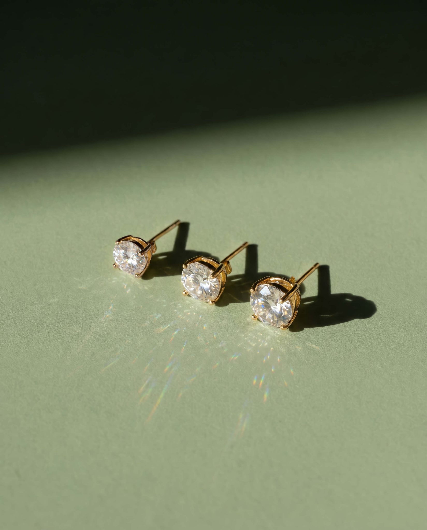
The first thing I wanted to do was create an image where the size difference is immediately obvious without needing to look twice.
I shot the three studs on a sage green background with a light coming from the side. When you use directional light on crystals, each stone reacts differently based on its size. A small stud gives a short, tight shadow. A larger stud casts a longer shadow and also diffracts the light more you can see small rainbow reflections spreading across the surface. The bigger the stone, the more it plays with the light.
The sage green background was a specific choice. That color absorbs blue and gray tones, which means the warm gold and rainbow refractions from the crystals show up clearly. It doesn’t compete with the jewelry, it lets it speak.
Light tells one story. Texture tells another.
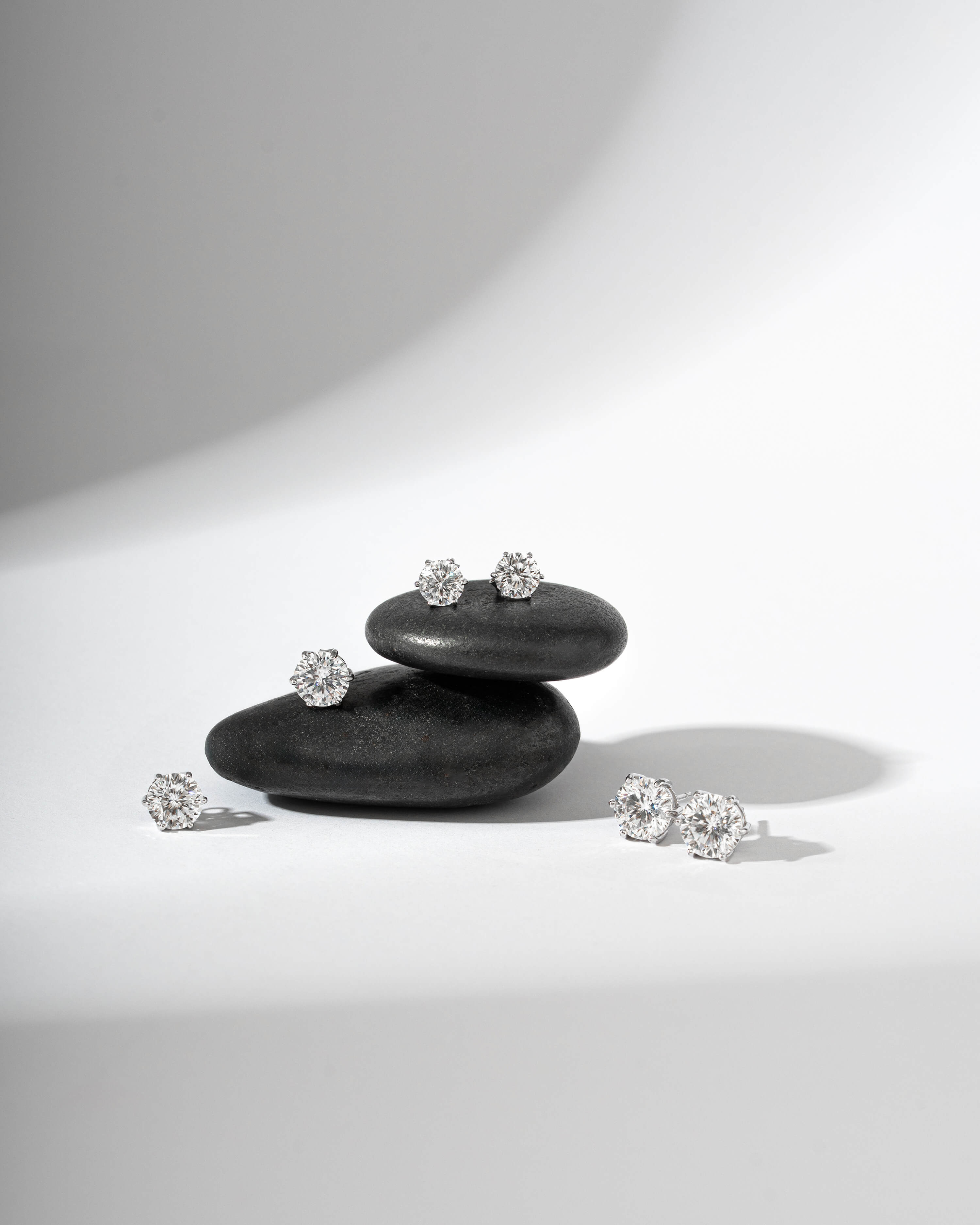
For the second setup I placed the earrings on black polished stones against a neutral gray background. The reason is simple: people know how big a river stone is. They have held one. When the smallest earring sits next to a stone and looks small, and the largest earring sits next to the same stone and looks big, your brain understands the difference immediately even without measuring.
This is something I think about a lot in product photography: what object in this frame gives the viewer a real-world reference? It doesn’t have to be obvious. It just has to be familiar.
The light here was soft and diffused . I didn’t want dramatic shadows competing with the texture of the stones. The composition is calm and precise.
Still life shots are important, but there is one question they can’t fully answer: how will this look on me?
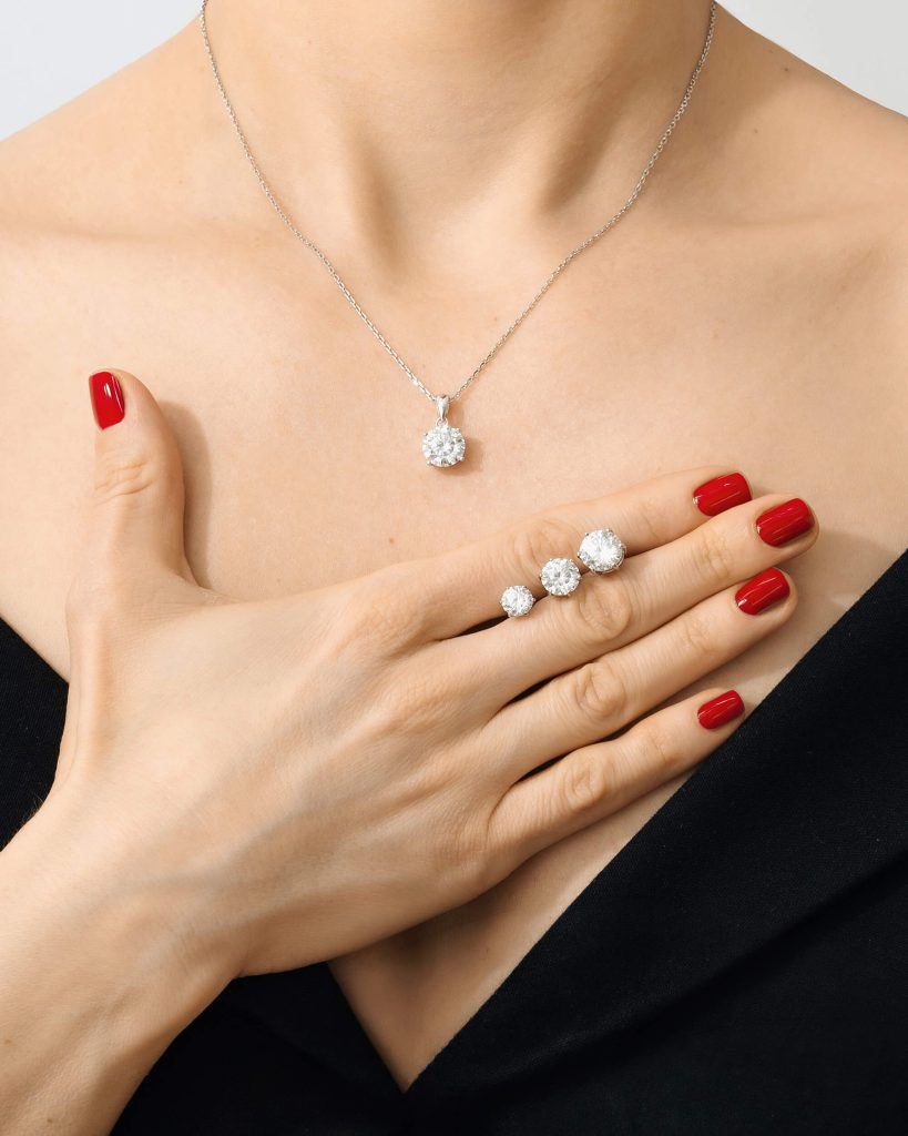
For this image I photographed three studs held in a palm dark outfit, red nails, a pendant necklace visible at the chest. The hand does something no background or stone can do: it gives the customer a real human scale. When you see a 4mm stud sitting next to a 12mm stud in someone’s hand, you understand the difference instantly.
The styling was minimal on purpose. Dark clothes, clean nails, nothing that pulls the eye away from the jewelry. I wanted the studs to be the only thing you look at.
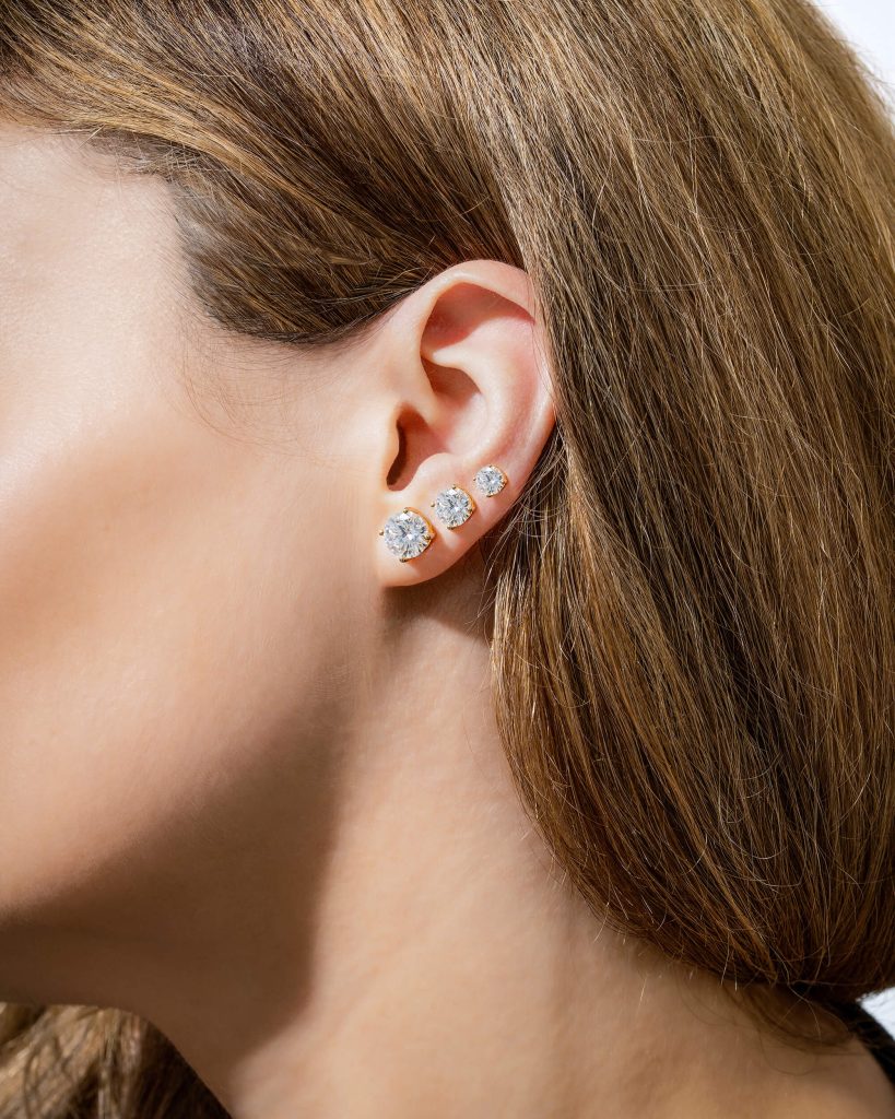
For the second image, I wanted to answer a different question not how big is it but how does it actually sit on the ear.
Three studs, ascending in size from lobe to cartilage. What this shot does that the palm cannot: it removes the abstraction. The customer is no longer imagining. She is seeing. The skin, the light catching the crystal, the natural curve of the ear all of it creates the context that a product page needs but almost never has.
The background is clean, the hair falls naturally, nothing competes. The jewelry is the subject. But the body makes it true. You can see more on-body jewelry shots in my jewelry portfolio.

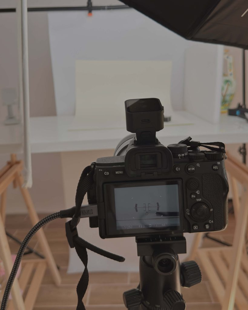
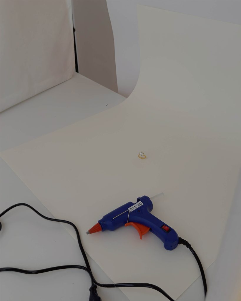
I include behind-the-scenes images in case studies not because process content is fashionable right now, but because they reveal something important: a strong image is the result of many small decisions made before the shutter clicks.
The background choice, the light source, the distance, the prop none of it is instinct alone. It is a series of questions asked and answered.
Clients who see the process understand what they are actually investing in when they work with a commercial photographer. Not just time in front of a camera but visual thinking applied to their product.
The styling was minimal on purpose. Dark clothes, clean nails, nothing that pulls the eye away from the jewelry. I wanted the studs to be the only thing you look at.
There is a category of image that does not inform. It seduces.
Not every shot in a product set needs to explain size or show detail. Some images exist to make you want the piece before you even know what it is. They operate on feeling, not logic.
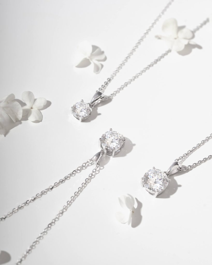
The flat lay with white hydrangea petals works this way. Three silver pendants scattered among soft flowers on a white surface. Nothing precise, nothing technical just light and texture and a very quiet kind of beauty. When someone pauses on this image while scrolling, they are not thinking about dimensions. They are already imagining the piece in their life.
This is a concept that designers and art directors understand very well: desire comes before decision. The atmospheric image creates the emotional context. The informational images close the sale. You need both.
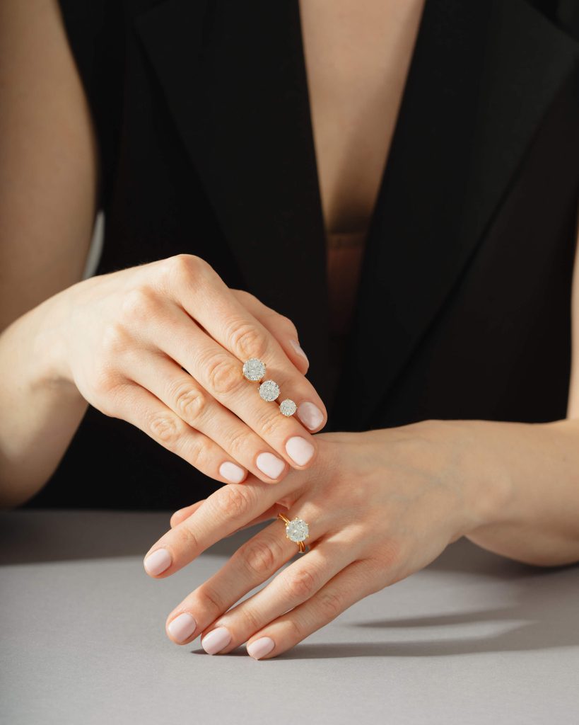
The editorial shot of two hands wearing rings operates in the same register different from a product shot, closer to a real moment. A gray table, a dark blazer, two different ring styles on two hands. It looks lived-in. The jewelry is not displayed it is worn. That distinction matters more than it might seem.
A set of five images for a single product is not repetition. It is a system.
Each image in this project answers a different question the customer is asking sometimes consciously, sometimes not.
When you understand what question each image needs to answer, the creative decisions what background, what light, what props, what styling become clear. They are not aesthetic preferences. They are answers.
This is the approach I bring to every jewelry and product photography project: building a set of images that works as a complete visual argument for the product. Not just beautiful. Purposeful.
If you are working on a collection and want photography that communicates clearly not just looks good, I would love to hear about it.