
★ Top Rated on Upwork · 100% Job Success Score

★ Top Rated on Upwork · 100% Job Success Score
Wellness Brand Photography: How I Built the Visual World for Quinton Hypertonic
Some projects stay with you not just because of the final result, but because of the entire process behind them. Working on Quinton Hypertonic is one of those projects.
It required the kind of wellness brand photography that goes beyond clean backgrounds and soft light: it needed a complete visual world built around the product’s identity.
The project started with deep research, continued in the studio, and ended in a creative space I was just beginning to explore product photography enhanced with AI.
It All Starts with Research
Before picking up the camera or opening Photoshop, I spent time understanding the brand.
Quinton Hypertonic is not just a product it’s based on science, with a story connected to the ocean and natural minerals. The audience is quite refined: people interested in real wellness, longevity, and performance.
So I looked at the bigger picture:
What does the global health & wellness space look like?
How do premium brands present themselves?
A few things became clear:
- The aesthetic has moved away from artificial green tones and generic nature shots
- The trend is now focused on minerals, textures, and natural light, stone, glass, sand
- Premium products are photographed like jewelry, not like medical items
- There is a strong focus on purity ,clean backgrounds, long shadows, subtle reflections
- Warm tones like amber and gold communicate quality and natural ingredients very well
The Quinton ampoule with its shape, golden glass, and honey-like liquid already fit perfectly into this direction. I just needed to find the right visual language to highlight it.
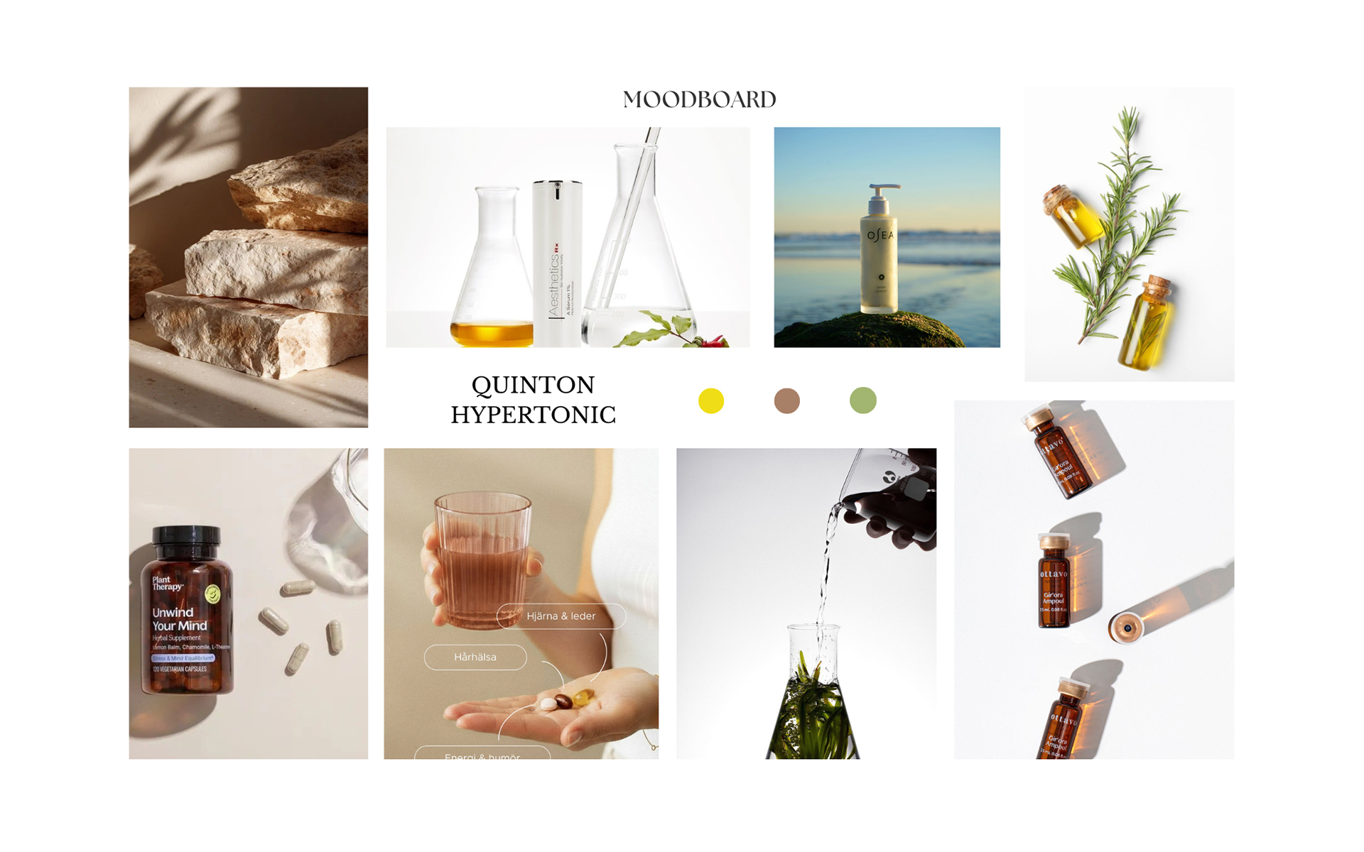
The Moodboard: Building the Visual Direction
After research, I created a detailed moodboard.
Not just inspiration, but a working guide that defined the light, textures, colors, and overall feeling.
A few key ideas:
- Light as the main element
The ampoule reacts beautifully to light, so I focused on references where light creates depth, shadows, and reflections. - Nature as a setting
Stones, water, salt, plants all connected to the product’s origin. - Repetition and rhythm
Using multiple products in a composition creates a strong visual impact and sense of consistency.
This helped me go into the studio with a clear direction, not just ideas.
The Studio Shoot: Wellness Brand Photography in Practice
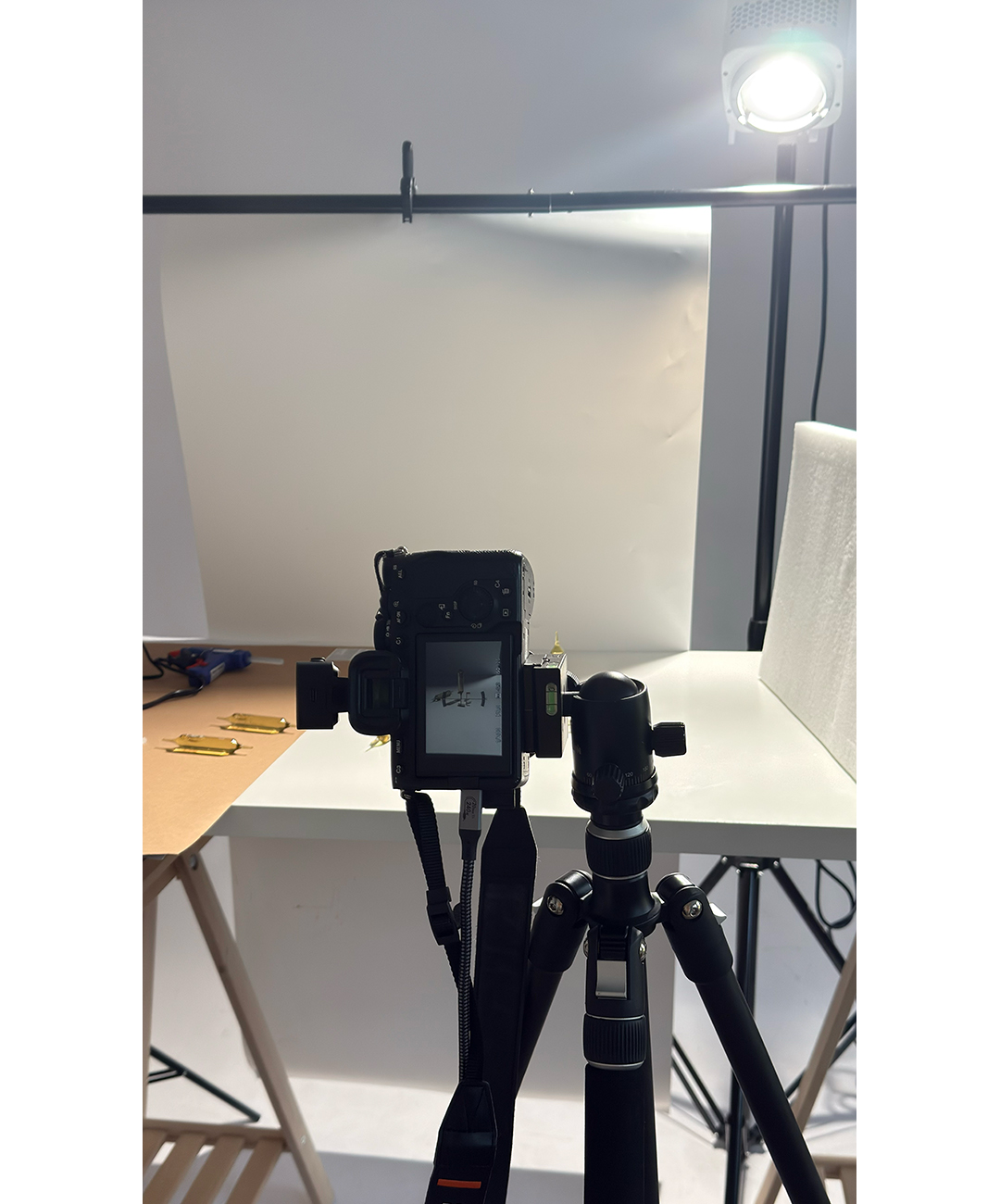
With the moodboard ready, I moved to the studio.
Angles that work
The ampoule shape is challenging long, reflective, and very precise.
These angles worked best:
- Side view (90°) — clean and informative, shows the product clearly
- ¾ angle — adds depth and makes the product feel more dynamic
- Top view (flat lay) — great for storytelling compositions
- Vertical balance — very striking, creates a strong visual moment
- In hand (lifestyle) — adds emotion and human connection
Lighting
I used mostly soft continuous light to imitate natural light, with reflectors to control shadows.
Backlight was especially important when light passes through the liquid, it creates a glowing effect that makes the product look alive.
The AI Creative Step: Going Beyond the Studio
After building a strong base in the studio, I moved into AI.
Not to replace photography but to extend it.
With AI, I was able to:
- Place the product in natural environments (like seaside rocks at sunset)
- Create compositions that are impossible to shoot physically
- Explore new ideas quickly
- Keep a consistent visual style across all images
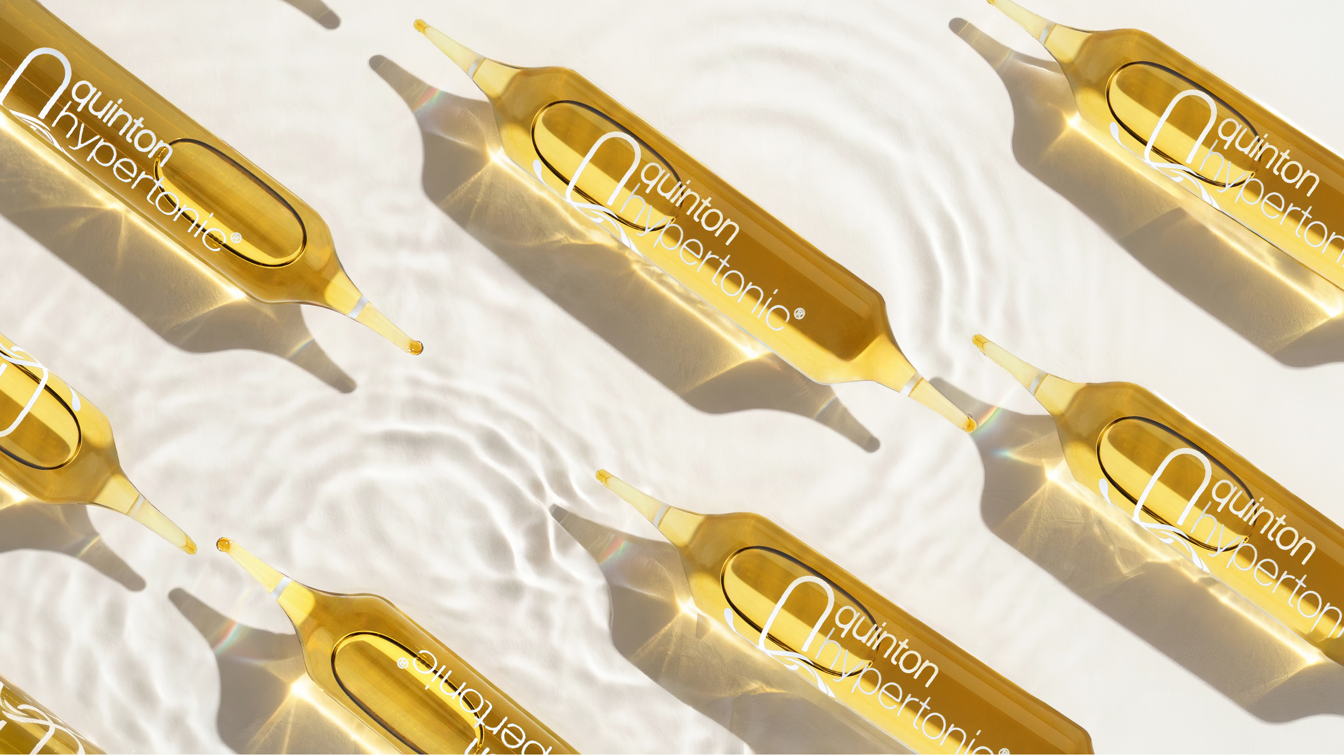
The Process
Each AI image started from a real studio photo or a detailed description based on the moodboard.
It took multiple iterations.
At first, the images looked good, but the product details were not perfect especially the label and shape.
So I refined the prompts step by step, adding more detail about light, textures, and brand-specific elements.
The final result is a mix of real photography and creative freedom images that feel both realistic and elevated.
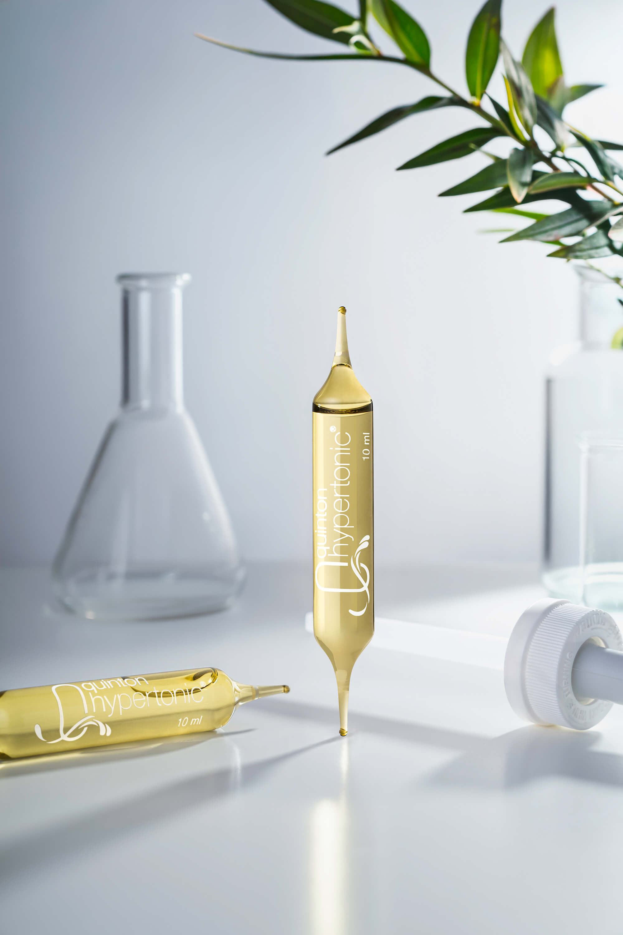
What I Learned
A few key takeaways:
- Do proper research: understand the category, the audience, and the competition
- A moodboard is essential: it keeps everything aligned
- Light is everything, especially with glass products
- AI works best when you already have a strong photographic base
- And most importantly: a good product makes everything easier
Quinton Hypertonic already has a beautiful form, color, and material.
My role was simply to place it in the right context and light.
If you are building a wellness brand and need photography that communicates purity, quality, and intent not just a product on a white background this is exactly the kind of work I do. Based in Romania, working with brands across Europe and worldwide.
If your product has a story behind it, I’d like to help you translate it into visuals that feel intentional, elevated, and true to your brand.
Whether you need product photography, AI-enhanced visuals, or a complete creative direction, we can build a visual world that helps your product be seen, remembered, and desired.
This website uses cookies to improve your experience. Cookie Policy